Responsive Web Design: A Guide For Beginners
Published on 22 October 16
 Tyler
Tyler0
1
Responsive web design has become more and more popular and at this point in time, I would call it the standard. Responsive design started when people first started being able to browse the internet on their mobile devices. This created a demand for website design that works on any device.
To be more specific, Ethan Marcotte was the original creator of responsive web design. In 2010, he wrote this articleabout responsive web design and how to incorporate it into your website. Since then, small to large businesses have been converting their website to a responsive design.
In this amazing guide, we are going to talk about responsive web design, what it is, how to use it, and why you need it for your business.
What is Responsive Web Design?
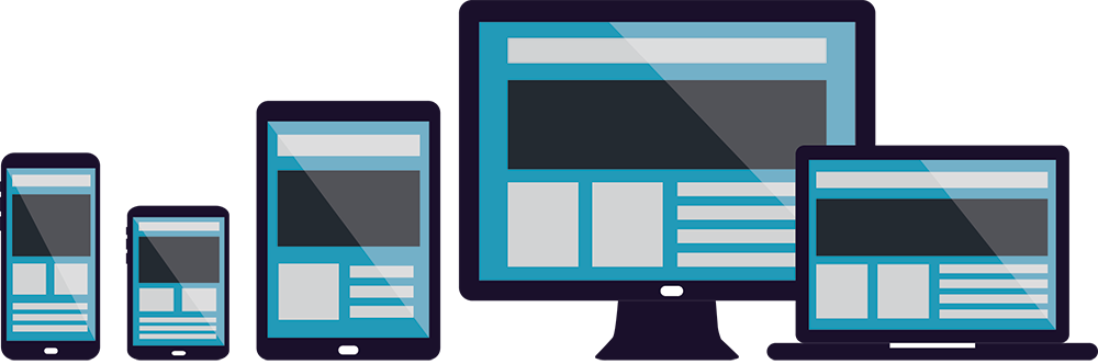
Responsive website design is a web design approach that allows a website to work on all devices including computer desktops, laptops, cell phones and any other device that can browse the internet.
Have you ever been to a website on your mobile device, but it didn’t show up correctly or you weren’t able to interact with it the same as if you were on a desktop? This means that the website was made without responsive website design in mind.
It doesn’t stop at mobile phones either. Responsive websites should also work on large screens, tablets and TVs. A truly responsive website will work on any device that can browse the internet.
Responsive web design uses HTML5, CSS3, fluid layouts and media queries to change the layout of the website based on the users device. We will dive into these key pieces that make websites responsive later in the article.
Why Do I Need a Responsive Website?
Now that you are somewhat familiar with what responsive web design is… why do you need it?
Well, the simple answer is… If you have a business website, its imperative that your customers and visitors can access your site on any device.. including mobile.
In this technological age, people are accessing the internet from a wide array of devices and if your website does not work when they find you, then you may lose that customer.
62% of companies that designed a website specifically for mobile had increased sales. (Source: Econsultancy)
Not only is having a responsive website good for better visitor engagement, but it also helps increase your traffic from search engines. Having a responsive website will increase your visitor engagement and overall time spent on your website, which will allow your website to move up in the search engines resulting in more traffic, leads and sales.
Making a Website Responsive
So you get what a responsive website is and why its so important…so how do you do it? Well, its a little more complicated then it seems. There are a few important pieces that come together to make your website responsive on all devices.
Fluid Layouts
The first step to making your website responsive is having a fluid layout. In the past, web designers would use fixed pixel widths or tables to create website layouts. Here is an example of how websites were laid out in the past:
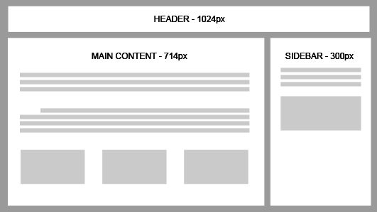
Each area had a specific width and it will span that width no matter what. As you can imagine, viewing this layout on a mobile device or table will not work since a standard mobile device is 480 pixels wide.
With fluid layouts, there are no fixed width or heights. Everything is proportioned out in percentages to expand and contract based on the device accessing the website.
Using our example before, if we wanted to convert it to a mobile friendly website, we would have to change the widths to proportions like below:
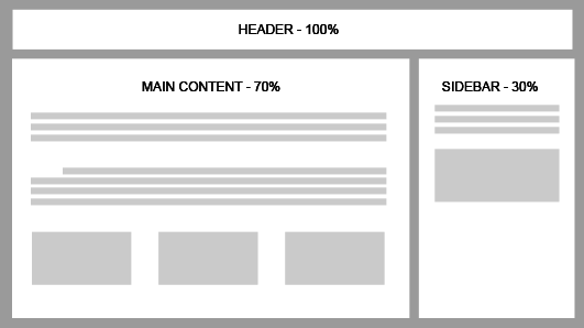
This way, if the browser is contracted or enlarged, the layout of the website will respond to these changes and span the correct percentage. The header has a 100% width so it will always span the entire (100%) width of the page. The main content area will span 70% of the page, while the sidebar will span 30%. Note that these numbers are rounded for simplicity but it’s uncommon that your percentage widths will be whole numbers.
Converting from a fixed to fluid layout will require a little bit of math to convert the fixed widths to proportions.
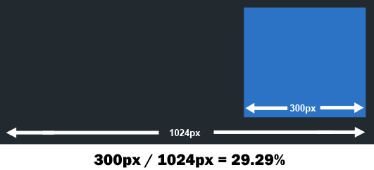
To do this, all you have to do is divide the target by the context. Lets say your fixed width website is 1024px (average screen size) like the example above. This means that 100% width is 1024 pixels. So if we wanted to calculate out a 300px sidebar to a percentage value, we would just take 1024px/300px which equals 29.29%.
If you are not a huge fan of math, you can use our responsive layout calculator tool to calculate your fixed pixel website to fluid widths.
Responsive Images
Another important piece of responsive website design is having responsive images because the size (both actual size and size of file) of the image has a huge impact on your website. If you have a large image on your website that is not responsive, it may mess up the layout of the site on a mobile device as well as increase the time it takes to load your site. Since most mobile users are on 3G or worse, it can take even longer to load your website if your image are all large in size. This is why responsive images are very important when looking at responsive web design.
There are a few different methods you can use to make your website images responsive:
Adaptive Images
The most widely used method for making images responsive is Adaptive Images. Adaptive images work by giving the image a 100% width and allow it to ‘adapt’ to its parent container. This means, if you resize the browser, the image will resize with it. Here is the CSS to make your images adaptive:
img { max-width: 100%; width: 100%; }Though this is the easiest method, its not 100% full proof by any means. The problem with adaptive images is that you are showing a single image (even though its getting bigger and smaller) that has a normal width and height. So if your image is small and you are expanding the browser width, it may get pixelated and blurry.
Another issue with adaptive images is page load speeds. If you are using a very large image to adapt to smaller containers, you may be increasing your page load time because even though the image is getting smaller its still showing the same image no matter what size it is.
HISRC
HiSRC is a newer method for creating responsive images that uses javascript to show different images based on internet speeds of the user. For example, If there is a high speed connection and the browser supports a device pixel ration greater, then a 2x image takes the place of the mobile first image.
Media Queries
Once you have a fluid layout and responsive images, its time to tie it all together with media queries. Media queries are conditional statements in CSS (cascading style sheets) that apply certain CSS styles depending on what device the user is on.
Media queries allow you to add device-specific rules for showing, hiding or moving content to allow for a better user experience for each device. Since each device and browser renders website different, it’s important to have specific instructions for each device, on how to show your website/layout.
For example, lets say that I have a button on my website that I want to hide from users on smartphones. I could use the below CSS to hide the button only on smartphones:
/* Smartphones (portrait and landscape) ----------- */ @media only screen and (min-device-width : 320px) and (max-device-width : 480px) { /* Styles */ .button {display:none} } With this code, if someone visits the website on a smartphone, any button with the class button will be hidden. This can be very useful in making your website look great on all devices. It does take some time and testing to go through your website on all devices and make sure everything looks good.
Here is some common CSS Media query breakpoints that can help you get started:
/* Custom, iPhone Retina */ @media only screen and (min-width : 320px) { /* custom styles */ } /* Extra Small Devices, Phones */ @media only screen and (min-width : 480px) { /* custom styles */ } /* Small Devices, Tablets */ @media only screen and (min-width : 768px) { /* custom styles */ } /* Medium Devices, Desktops */ @media only screen and (min-width : 992px) { /* custom styles */ } /* Large Devices, Wide Screens */ @media only screen and (min-width : 1200px) { /* custom styles */ }
Wrapping Up
In conclusion, having a responsive website is very important for any business or website owner. Allowing your website to be accessible and engaging on every device will increase your leads, customer and sales online.
Converting your website to work on all devices and browsers can be a large task for a small business. If you want a responsive website then look no further! We create stunning responsive websites for small to large businesses who are looking to get more customers online. Currently, we are offering a promotion where we will design and create your newresponsive website for FREE. You don’t have to pay until you are completely satisfied with the results (which we are sure you will be).
Have any questions or other suggestions?
We’d love to hear them in the comments!
This blog is listed under
Development & Implementations
Community
Related Posts:
Post a Comment
You may also be interested in
Share your perspective

Share your achievement or new finding or bring a new tech idea to life. Your IT community is waiting!