If you believe that people do not prefer shopping using tablet PC and smartphone, you should think again.
Report released by Capgemini and online retail industry association-IMRG during February this year suggests that 51 percent out of the total online sales in the UK made between November 2015 and January 2016 were done using smartphone, tablet PC. People use them perhaps because they can shop anytime and anywhere.
Figures are interesting because just 49 percent of the overall online shopping was done via laptop and desktop during the period under consideration. Thus, offering the best possible customer experience on mobile devices has become a necessity.
Trends are changing in the US as well, according to the
report published by Forbes Magazine, research firm Gartner has predicted that by the end of 2017, 50 percent of the overall online sales in the US will come from mobile e-commerce.
Responsive theme along with spaciously laid out buttons can do the trick
These days, people use mobile computing devices with various operating systems to access e-commerce sites. So, it's important to make sure that your website's theme is responsive and can automatically adjust to offer the best experience to customers. No matter if they are shopping on your site using their laptop or using a smartphone with a 4.5-inch touchscreen, customers should be able to see the same version of the site on all devices. A responsive theme automatically adjusts buttons, menu, and content as per the device size that customer uses.
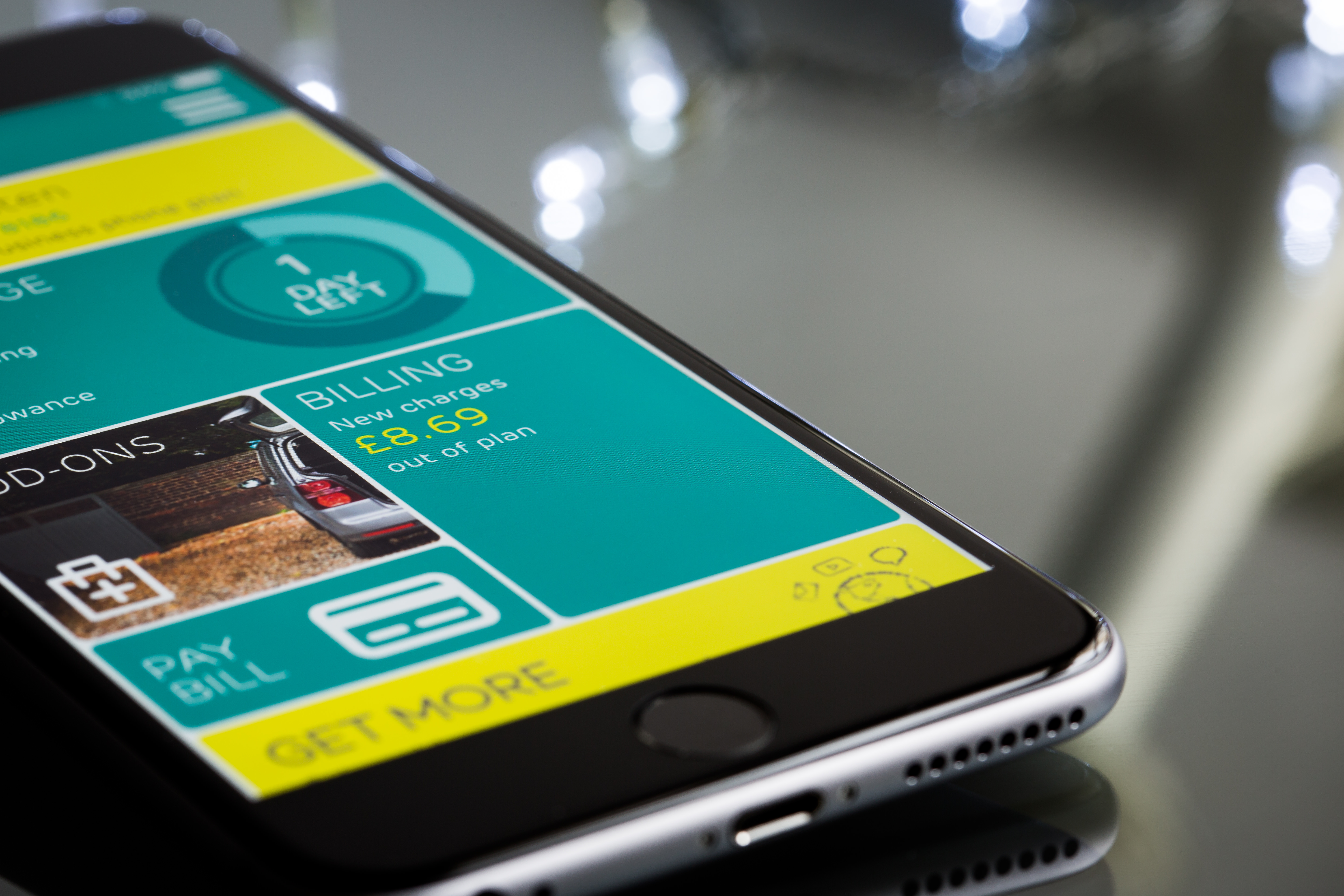
A customer should be able to browse, purchase the item, make payment and even select delivery options using his/her mobile device within a fraction of seconds.
Remember, customers should be able to press buttons easily even if their device's screen is small. Spaciously laid out buttons, especially, the BUY button will make sure that your sales figures remain high. Keep the payment mechanism simple. Make sure that there is no page orientation issue. Same rules are applicable to mobile e-commerce apps as well.
Don't be stingy when it comes to spending money for offering great customer experienceIf your mobile site or app fails to deliver the best
customer experience, people might just abandon their shopping cart before hitting the BUY button.
Results for a study conducted by research firm Baymard Institute shows that two out of three customers using desktop and laptop abandon their shopping before purchasing anything. When it comes to the check out rates for people using mobile and tablet PC for shopping, it's 70 percent low. This means, people using mobile computing device would change their shopping plan if they do not get a positive feeling while browsing the site or using the app.
Mobile e-commerce is expected to continue its growth even during 2017, so, it's obvious that your investment on customer experience will definitely show good ROI.
If you are looking for a company that offers impressive web and digital marketing solutions, you should get in touch with
netandco and can be reached at their social profiles at
Twitter,
Medium.com and
Pintrest Their themes would offer intimate and highly personalized experience to site's visitors. From website's maintenance, digital content management, data analysis to managing social media campaigns, their professionals would make your work easy.
 Ashwin