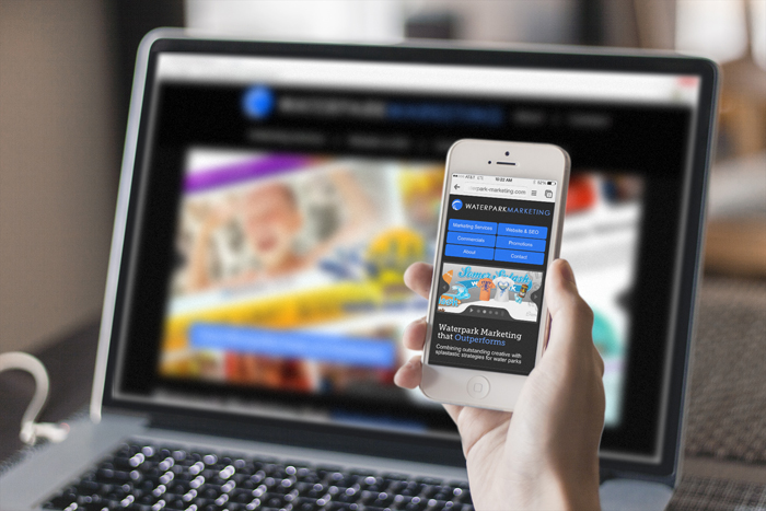
In an era where mobility has become the norm, businesses cannot survive without a responsive website design. Now what is a responsive website? It is a website that is designed to provide users an optimal viewing experience and easy navigation across all types of mobile devices such as a tablet, palmtop, Smart phone, iPad etc.
See, how professional web designers can help get Responsive Website Design.
The use of mobile devices has exponentially increased and the impact can be gauged by the global mobile data traffic that grew by 81% in 2013.
It is predicted that in 2018 - the traffic via mobile connected tablets alone will be nearly double than the traffic generated by the entire mobile network in 2013.
In global scenario where use of mobile devices for shopping, surfing and several other activities has increased manifolds, having a responsive website should be the top priority for businesses. However, in a recent survey it was discovered that, approximately 45% businesses do not have a website design that was designed to provide a great user experience on mobile devises, and only 30% consider going responsive to be a top priority business strategy.
Having a responsive design is the most critical and an incredibly important business strategy for ecommerce websites. According to statistics, 67% users are likely to make an online purchase through a mobile device if the site is user friendly and loads quickly.
The broader considerations for a responsive or a mobile friendly website design and development should be that:
- It should be designed for the fingers, i.e. a user should be able to reach the navigation points and touch click on them easily. Avoid using cramped up navigational elements and fancy hover effects.
- It should Load fast - responsive websites are for those who love mobility, to surf, shop, read while on the go. Now if your websites takes an eternity to load, the user will be quick enough to jump to another website (probably your competitors).
- It should be clean and appealing - The content display and images should be such that they adjust to different screen sizes and display resolutions. By using scalable vector graphics or retina images, crisp layouts can be maintained across all devices.
A non responsive website design might actually be stifling your business and not allowing you to grow or rise over completion. If you do not have a responsive website design, this is the right time, add it to the highest priority business strategy today.
Hi-Tech ITO is a professional website design and development firm based in India. As client satisfaction lies at the core, the company leverages its expertise in order to deliver highly qualitative solutions combined with on time delivery and flexible pricing models.
 Chirag


The present World is an era of mobility and smaller devices and no doubt a large volume of people prefers to visit websites via their smarphones and other smaller devices. If your website is not responsive, you will surely miss such high amount of visitors which can ultimately ruin your business and popularity. When using WordPress, you can make your site mobile friendly by employing responsive WordPress themes on your simple portals.
Responsive web design also gives global level customers to their website.