MyPage is a personalized page based on your interests.The page is customized to help you to find content that matters you the most.


I'm not curious

Responsive Design Techniques - Mobile Design First Approach

Published on 11 February 15
0
3

People using internet from their mobile phone or any other such gadgets are increasing. It is soon possible browsing from desktops will be minimal, just for official purpose. In such case mobile first approach can prove very feasible for web designers and developers. The idea here is to create basic design which works well on mobile phones and then go on adding more design elements and features for tabs, laptops and desktop versions.

Constraints on Mobile Design

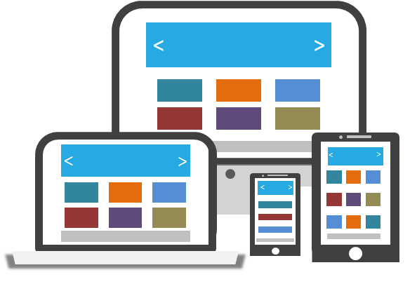
The world of mobile phones is unstable, diverse and at the same time restrictive. Screen size is the main constraint while designing layout for mobiles and smart phones. Another constraint is portrait and landscape orientation of these devices. Performance and limited bandwidth, mobile data-packs could be additional limitations. So it forces developers to create effective designs which convey main message rather than having fancy design patterns and heavy images. One positive thing to note here is that designer can put all focus on the main contents rather than peripheral design elements. The design can grow with the same main content layout for other bigger devices.

Using Desktop Version with Fluid Layout on Mobile

Designing websites for mobile phones or smart phones require a very basic features and hence mobile first approach works very well. It is not just about fitting the desktop design on mobile screen but to design a good and comfortable user experience while a user browse your website from smaller device. Designers always think that if they make fluid layouts, then their website will fit or scale down to fit inside small screens. But when it comes to browse or use the same desktop website from mobile device, user can face lots of problems. Scrolling vertically (sometimes horizontally too) to read long paragraphs, clicking on small-sized buttons and links, navigating from one page to other can be real difficult and user may need to use zoom feature.
Responsive Design Techniques - Mobile Design First Approach - Image 1

In the above templates, you can see blocks places in different ways for multiple devices.

Mobile First Approach

Mobile first approach should lead to define layout on the basis of content. Of course, what needs to be shown to user is of prime importance rather than how. Information or data should come to center-stage and complex design elements can be developed around the main content block. This can be very natural process of conveying website objectives to users. Mobile Design first strategy was presented by Luke Wroblewski where he highlighted the need to decide mobile design first when starting to new website. Progressive enhancements strategies can then add different design elements or layers of enhancements on the strong design layout. For using RWD as designer or developer, you need to change your traditional thinking process and think in a totally new perspective. It is time consuming process involving lots of planning, iterative executions and more time. But once your basic design with building blocks is ready, the construction and enhancements becomes very easy.

Conditional rendering of layout or CSS styles can be avoided if you adopt mobile first design style. Conditional rendering may not work always and it is not considered as best practice for responsive designs.
This blog is listed under Development & Implementations Community

Post a Comment

Please notify me the replies via email.

Important:
  • We hope the conversations that take place on MyTechLogy.com will be constructive and thought-provoking.
  • To ensure the quality of the discussion, our moderators may review/edit the comments for clarity and relevance.
  • Comments that are promotional, mean-spirited, or off-topic may be deleted per the moderators' judgment.
You may also be interested in
 
Awards & Accolades for MyTechLogy
Winner of
REDHERRING
Top 100 Asia
Finalist at SiTF Awards 2014 under the category Best Social & Community Product
Finalist at HR Vendor of the Year 2015 Awards under the category Best Learning Management System
Finalist at HR Vendor of the Year 2015 Awards under the category Best Talent Management Software
Hidden Image Url

Back to Top