This is sheerly my opinion and purely not to hurt the sentiments of any one: functionality will die one day and only design will rule.
This disclaimer was given because just a couple of days back i was about to get hit by a lady (who happens to be a programmer and my friend too) while discussing about upcoming trends over drinks. No offense to all the functionality programmers and I want people to believe that I am not acting as if I have been bestowed with a gift of clairvoyance. For instance, let's take an eCommerce website, we can have limited functionalities such as checkout process can be optimized, the way we showcase our products and some more. Wherein, when it comes to design, we can make never ending iterations with the way we arrange: things, figures/shapes and of course colors used to design our landing pages.
Actualize the Goal of you landing page:
According to study from Jacob Neilson, only 23 % of the visitors who are visiting your website for the first time and 16% of those who are for the second time choose to scroll down to view your complete website. Rest a considerable 77% of them see the above the fold area and do not prefer scrolling.
Unless you won't specify your destination you won't be able to achieve your desired goal. Make sure to make a target and then proceed further.
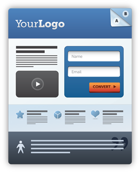
The placement of your call-to-action
The placement of call to action is extremely important for a high yielding website. People generally believe that keeping the content above the fold is the best solution, but I believe that this is the most prevalent myth among the designers. No matter what all people say, go by your instincts.
Though this do not means that CTA do not performs good when kept above the fold. There are numerous sites with CTA just above the fold and have yielded great conversions, but we this is not enough to make it a standard place for placing CTAs. After going through a numerous productivity test, we have seen that the position of the CTA has a correlation with the complexity of product/offer.
Which means that if the product delivered on the website is complex, then your potential users will need some time to grasp its details and thus they need time to make a decision. Wherefore, the CTA must be placed at the lower side of the page.
Likewise, if the product is simple then the users do not need to much time to make a decision. Wherefore, the CTA can be placed just above the fold. For instance, say household products, users do not need to know much about the products all they need to do is to buy. On contrary if you are steeling automobiles or electronic gadgets, you need to give proper space to let the users think and then take a decision.
2) Information on your landing pages
Another thing which you need to be careful about is to place the amount of information on you landing pages. We have seen that the designer group is divided into two groups one which opts for short-form and others who like long form for designing their landing pages.
As there is no one remedy for this problem, as your landing page must contain all the information needed in order to make a convincing argument to sell your project. This is only how you can convince your potential customers and help them in making the right decision.
Moreover, I have seen that long landing pages perform well if you have complicated listing or offers on your page and they also tend to increase the level of anxiety. Wherein, short-form landing pages are best for simple offers and they offer a low anxiety level.
3) Your button copy
Button copy is extremely important to cast an impression or ignite some verve in your potential users. Every single piece of content on your website matters, so why it wouldn't if it is placed inside a button which is the highlight of the page. It was noted that changing the button copy form Get to Order improved the conversion rate substantially.
One can certainly not obtain the highest conveying value and the more you will achieve, the more you will yearn. One can settle for getting the most relevant for your websites' conversion .
In order to get high yielding copy buttons you need to write meaningful and relevant content on you copy button. Relevance of the content is directly proportional to you conversion rate. Evaluate your button copy which you are currently using such as Order Now or Start your journey. You need to check the treatment it offers and its relevancy in terms of your business goal.
Conclusion!
Do not just choose once for all design options. Be experimental with the content and the placement of objects on your landing pages. This will help you to gain long term growth.
 Samuel