In mobile app designing, we have to take care of two types of users. One folk is of frequent users who are familiar with our UI components and their roles in their task so they never stay much to make choices and act mechanically. They have clear-cut agenda-finish task, at hand quickly. Therefore, mobile app designers need to remove all steps and UI elements, which are unnecessary for them.
Apropos to this, infrequent or new visitors on your mobile app might have problems to take right decision before each or certain actions on your UI because they are unfamiliar and need time to make right choice along with obvious guidance. Thus, the job of mobile application designing team becomes tough to keep balance between guidance and speed of the process or workflow on the screen. This ultimately demanding addition of desired frictions in order to slow down users’ task finishing process.
Understanding the Frictions
This is a bit complicated in words, but let’s take some appropriate examples to understand them. Email checking is the most frequent task we all do on our mobile screens. Whereas filling tax forms using Turbo Tax software is a task that we do only once or twice in year for either federal or state taxes. In email checking, we never like to have any friction at all and wish to accomplish our tasks as quickly as possible.
Contrary, tax filing process needs enough time to understand the demands of fields and some guidance to take right decisions. Therefore, tax filling mobile applications needs involvement of some instructional texts and icons besides some essential fields. Thus, users will stay for a moment and push the ? icon in the adjoining area of the field to know about that field in details of options to make choices. These additional UI elements slow down the task accomplishment, but offer successful accomplishments at the end. Thus, they are desired frictions in mobile app designing during momentum designing.
How to Control Momentum with Deliberate Frictions
Now, we understand the momentum and its role in UI designing. Therefore, let’s take some valuable tips to control momentum by adding desired frictions at desired levels. We can add frictions in UI in different ways such as:
By fragmenting a big task into smaller parts: this will add some additional steps in the task, but will offer sufficient time for users to think over their choices. No doubt, unnecessary taps may hinder the user experiences if they have done in excess.
By adding some instructions: in order to guide our users we have to add some instructional texts at important places in UI or use some symbolic icons. If we do this without calculating, the time spend on the UI and user experiences by-and-large, they may create frustrations among the users. Therefore, use texts and icons in smart combinations.
By changing entire UI and modules: in order to avoid unnecessary frictions and improve user experiences, we have to make deliberate changes in our UI and we can understand this by following instances.
Redesign UI to Add Frictions in Momentum
As seen above, in some cases we need entirely new design of our UI in order to add frictions in momentum.
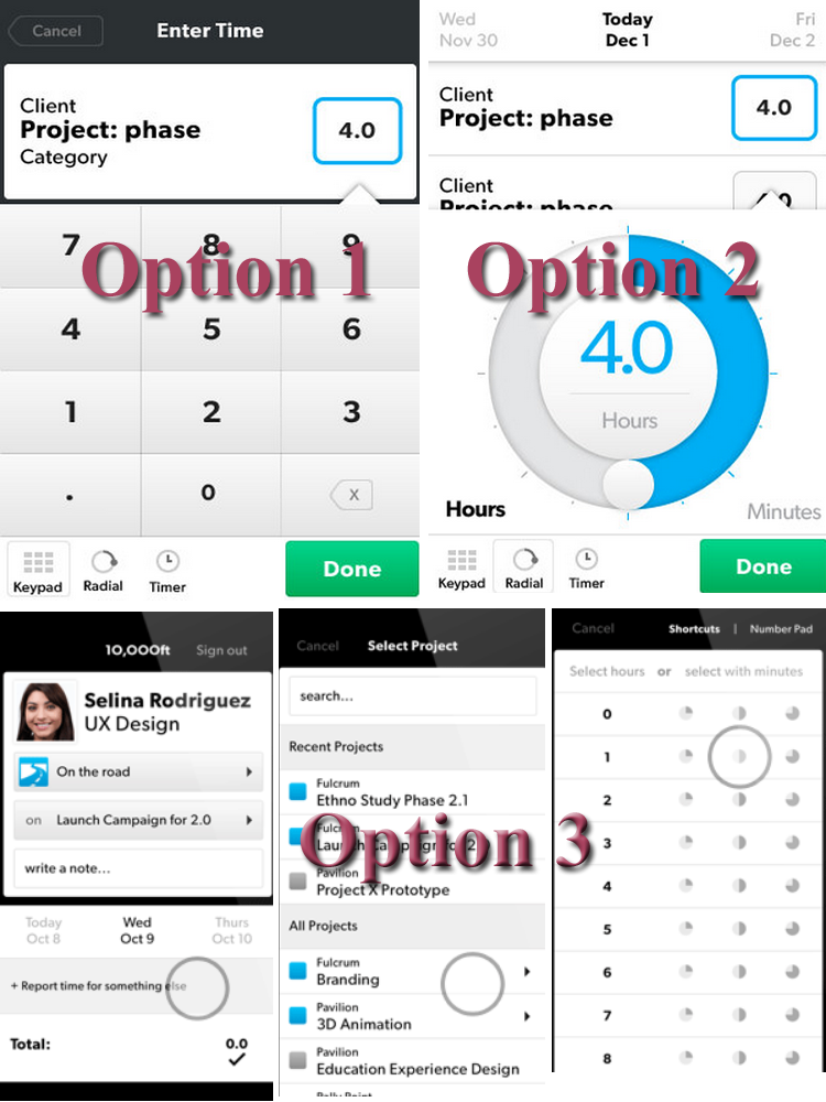
For instance, if tax-filling process needs entry of numbers to show hours, you may use conventional UI element-keypad with numeric symbols. This will be okay for infrequent users like tax return fillers, but it won’t work in case of flight booking mobile apps where you have to make quick entry without losing or jumping from the current UI.
Thus, adding keypad for each mobile app design is not advisable and mobile app designers have to think in some innovative ways to enter hours/numbers, quickly, without going to keypad UI, forth and back. Thus, you can imagine a separate hours listing in button forms as depicted in the image above. This involves only two taps and without jumping to complicated keypad UIs. Apart from this, we can use a radial dial for hours entering process, but they again need some more steps in UI and we don’t want them.
 Mehul
Mehul