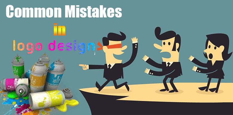
What are the General Mistakes Made while Designing a Logo
Have you ever given a thought that how we generally recognize a company or keep its image in mind? Yes, through a logo. However creating an exclusive and alluring logo is a mammoth task and a lot of expertise is required to build it. On the other hand, under web development process, when amateurs and even sometimes experts, try to create a logo, commit some most common mistakes and ruin everything. If you too have an assignment to create a logo and as an amateur, you do want to make it perfect in the very first attempt, you must go through the following points to avoid any flaw.

Typographic Fuss
Never use several fonts or weights. Also, avoid the use of ultra thin and predictable fonts. Pay close attention to spacing, kerning and sizing and most significantly, ensure you have opted for the correct font for the project you are dealing with.
Very Complex, Very Abstract
Logos that simple and easy in their built can be remembered for a long time and have their own identity aiming at the crowd. With no over statement, it must have its own part to share. The simplicity of a logo not only makes it memorable, but turns it more versatile as well. It can work over more mediums. For instance, a logo should work on something the size of a postage stamp and not similar like a billboard. Do not have your logo extremely abstract either.
Dependency on Special Effects or Color
Effective logos are not made using special effects or with the use of so many colors. Try black and white instead of using colors in your first attempt and then put special effects or colors. This will make you focused on the main concept rather than rests. Never use embossing, drop shadows, or other layer styles to put extra effects in the logo as it will have its impact without adding much to it. You can also try various contrasts of a logo to ensure it works in color or grey scale.
Using Raster Images
A logo should be created in a vector graphics program like Adobe illustrator to ensure that the final logo can be enlarged to any size, allowing it to be applied easily to other media platforms. Mathematically precise points are used to make a vector graphic and this ensures visual consistency across all mediums and sizes. A raster image, (which is made of pixels, such as what you get in Photoshop) cannot be extended to any size, especially large sizes otherwise the logo will get useless. Use a vector graphics program when creating logos.
Create a Monogram Instead
Creating a monogram instead of a logo is one of the commonest mistakes that even inexperienced designers commit. They play with the company’s name or initials to frame a logo. For instance, Italy’s Leather is used as I & L to create a logo out of it. Although, this can be a great idea to simply use the company’s name and easily use the credibility that it has earned during the course of time, however, the difficulty is faced when you want to convey the intended message through it. A designer can go for it, but he must not settle on it unless he gets a creative, original and unique solution built to reflect the business goals.
Conclusion
It is noteworthy that though the list includes most of the common mistakes, nevertheless, there may be some other ordinary mistakes having the same weightage. Remember, there are three steps to create an original and alluring logo explore, rough sketch and create!


 Sumit
Sumit


