Online shopping is changing gradually and so are the online shoppers these days. The more attractive it looks and with easy operations to perform, consumer won’t hesitate to stop and shop. Now shoppers do expect it to run in a way that makes the overall experience satisfying and for that certain things are to be taken care of, say like positioning of the Logo has to be prompt and functional, a proper placement of the search and navigation bar and more importantly a design that is tailored for mobile devices.
With the competition around, the thing of today might not survive the face of tomorrow. What you design certainly has to be a step ahead of the competitors in the market. Every minute detail crafted has to have its own potential, be it with the Typography of the store or even choosing the right colours or even the product photographs displayed. The motive has to be simple, lure more shoppers and even those who don’t prefer shopping online.
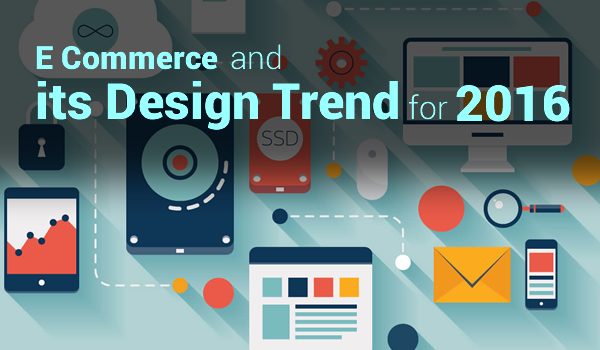
With that being said these are some notable E-commerce design trends of 2016, which might give you the knowledge of designs and guide you well enough to build your own ecommerce store.
Dynamic Product Search
It might not happen that the product you are looking for be seen on the homepage itself. Search bar has to be there where a shopper can see it. Vastly use by other competitors, it is usually placed in the Header Section. Sites have been using Dynamic search in 2016, which enables a dynamic view of the product which eventually helps consumers to browse the website with ease and prevents the hurdle of seeing search result every time on different pages.
Not Just Animation
The more presentable you are the more recognisable you will be. Making shopping experiences like stories, you need to be more aware of the facts that consumers demand more when it comes to living a shopping experience online, which indeed has to be more fascinating and not blunt. This is when Motion Animation comes in; it is a way of demonstrating your product in a very beautiful manner without being monotonous. If you have a gift shop or business in fashion, surely this is a trend to follow in 2016.
Place the Logo Where It Belongs
Placing your store Logo on the top left corner or even at the top centre of your homepage is more preferable rather than placing it somewhere in the bottom. The Logo has to be functional and not just some random animation that does nothing. Clicking on it should land the shoppers back to your home page. Even adding an Easter egg as a surprise to the logo can add some charm which consumers won’t mind.
Easy Checkouts
Design must be such that it shouldn’t confuse the shopper of what to do next. Keeping it simple is the safest yet a smart bet. When a shopper has made his selection, the checkout or cart bag should be visible to them. Adding a picture of a Cart or highlighting it enough for the shopper to see it shouldn’t deem down their experience. Placing it on the upper right side of the page is more advisable.
Design Tailored For Mobile Devices
It is easy to say that the consumers who shop online prefer their mobile devices more than using their desktops. The term quite popularly used in 2016 called Mobile Hamburger Menu or even sidebar menus. The basic functionality of it is quite simple. It consists of two or three horizontal lines which functions when a consumer taps on it and series of events fall in line. That does save the screen space on small devices and even show more content on a larger screen.
Design That Is Responsive
Certainly a feature you shouldn’t overlook. With mobile devices having fascinating animations and a user friendly experience; it should display the content magnificently on any given device. Not only mobile phones but with High Resolution TV sets that offer browsing and shopping experience are also following the same trend. Mobile devices are easily connected to TV’s these days. If a consumer browses through his phone and ends up continuing the experience of TV, a support of multiple devices is equally important for your Ecommerce website design.
The Card Layouts
Every card holds a story and it unfolds when a consumer taps on it. Card contains all the required information for the consumer to know. It can be organised in any manner that pleases the consumer and tends to be very responsive. Being responsive enough, they offer simpler navigations and thus improve the consumer’s experience. They can be highlighted to grab attentions of the users to know about the new offering of products or new offers.
We are halfway through 2016; Ecommerce is nothing but a growing Giant. With Designs that are setting high standards in the competitive market, your store must have a design that changes the way consumer shop online.
View more information on magento ekspert, outsource e-commerce utvikling and woocommerce utvikling. This expertise of the author has really been appreciated by viewers.  Kaspar