An Assessment of Minimalist Design
Published on 29 May 17
 Sarah
Sarah0
1
A minimalist web design approach is that seeks to simplify the interfaces by removing needless elements or content that doesn’t bear user tasks. Minimalism has been around nowadays, in fact a welcome alternative to excessively busy and unnecessarily jumbled websites, ads logo and posters.
In order to minimize a website to its most essential elements, designers must accept a flow of consequences that impact the user interface (UI) and content of the site. For those who are unaware, the concept of minimalism is concerned with stripping away the overload and placing the remaining elements.
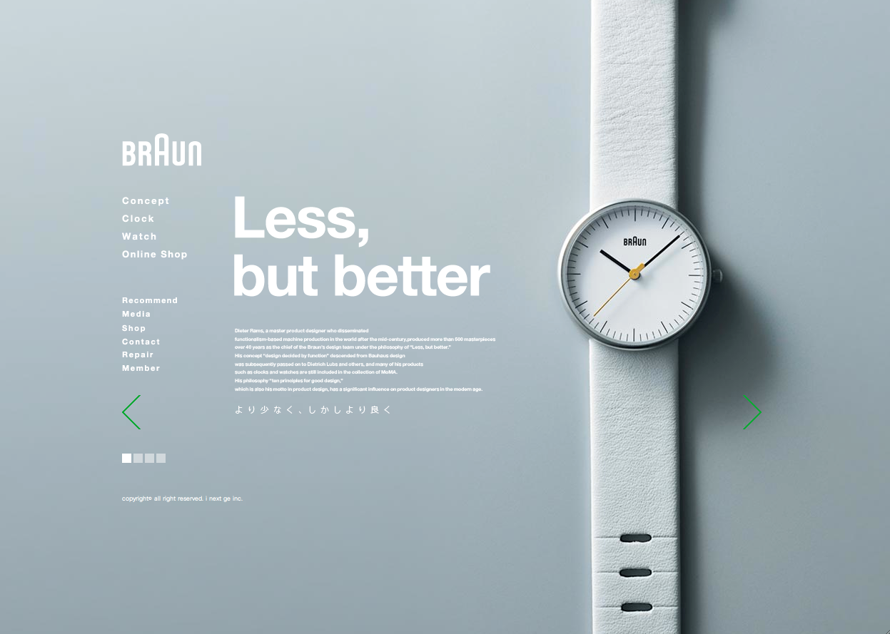
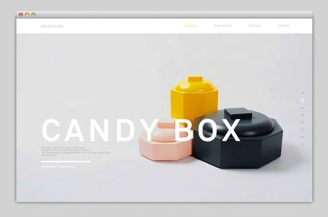
Like a language, Web Design is defined by the way people use it. The result can be encouraging yet influential design that is efficient to convey its message. You can find minimalism from architecture to fashion and logo design. To get the minimalist design, may it be something small like logo design or as large as classified ad, be sure to use the right elements. Layout, colors, typography and graphics all play a vital role in minimalism. Let’s discuss some principles of design and how they relate to minimalism.Effective Minimalist Layout

A minimalist design layout is especially tricky because each element you’re working with is necessary. The content of websites should be in such a way that a viewer can find it easily without much thinking. In short it should be logical. In other words, an effective minimal layout design of website is very important part of web designing; omit needles things and using less to achieve an effect that’s more than the sum of the design’s parts is the goal. We need to remember that going for a simple layout instead of a complex one is the key to keeping readers interested.
Empty or White Spaces
White spaces give power to the small bits of information. The more the empty spaces the more power an object gains.

Negative space also serves to form a group of elements and then create balance. We must always remember to deliver a page that will get viewers attention. Whitespace is actually really important to web design because you can use it to get better readability and website performance. White is a part of make it simple and less is more mantra that proves to be effective when designing the web. White is actually a portion of page left unmarked or left blank or an empty space. In web design terms, it’s the space between graphics, columns, images, text, margins and other elements.
Graphics
In minimalism the images used are much planned. Graphics are used by the designers for their efficiency and in minimalist design they use it when the image is more effective than a written message. Graphics should be used carefully and advantageously and relevant to the topic. Don’t get caught in too many images or visuals just make one dominant not necessary large.
Typography
Typography in minimalism should also be considered as other elements are. Attractive, sharp and even custom typography is a perfect in a minimal framework. The most remarkable examples of minimal design and typography consist of bold styles with solid strokes and motivating letter forms for example a leading typeface for headline is paired with a neutral typeface for other content. The main purpose of typography is to convey a message but in minimalism straight forward communication is of important, since from design not much of the meaning can be drawn. Using 1-3 fonts is your best at maintaining a minimal and efficient design.
Color Choice in Minimalism:
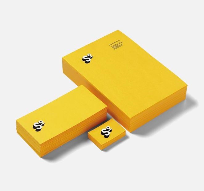
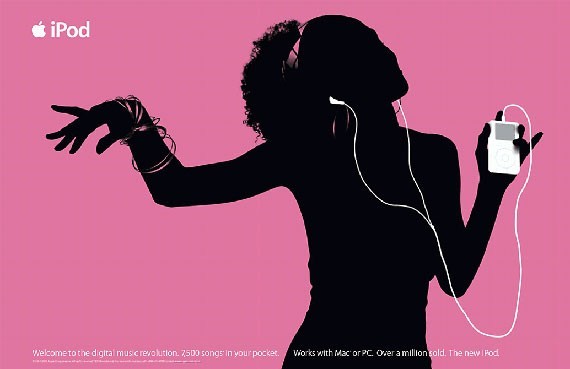
In minimalism the color choice is also planned but many people think only monochromatic color palettes like black, white and grey are the end all of minimalism, but this isn’t true colors can be used for an attractive design without preceding minimalism. Just keep the color palette small 1-3 will do the best. Like in the above image, where the bright yellow is balancing the strong white and black logo and working collectively to make a booming and striking (within the limits of minimalism) design with a big standout. Therefore, the majority of designers choose bold and bright primary colors for minimalist design.
Web Minimalism:
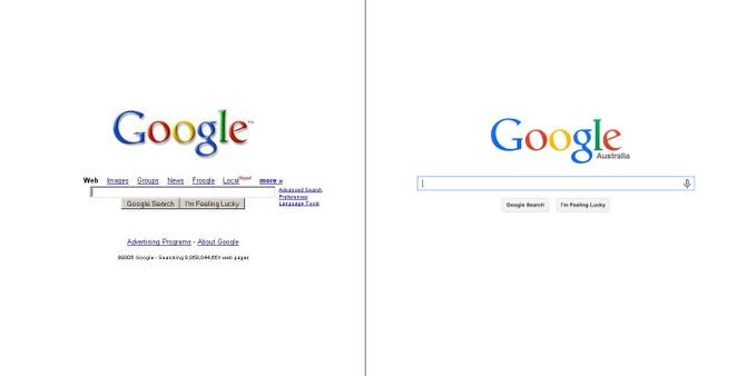
Minimalism can be a very important component to your design as it has the possibility to be everlasting. The less elements you use the greater the chance they are to go out of style. A common example of this is Google. Even with small changes in Google the ultimate minimalism of the website kept the design eternal. Some designers have misunderstood the idea behind minimalism and designed web pages that are empty of content and doesn’t make logic. But good designers have created websites that are pleasant and even easy to navigate.
Media Minimalism:
Minimalism means using limited material to create a desired effect. Even in media, packaging, brochures and ad campaigns have their share in minimalism. Many designers use modernize design from movie posters, band posters to advertising posters to show the effectiveness and to convey the message rapidly and minimally. Minimalist posters are designed to use its elements in such a way that a message can be send in one graphic. The result is generally a poster, not only well-designed but also aesthetically satisfying.
The Art of Minimalism in Logo Design:
It’s very important to be minimal in logo designing as it’s already a small graphic icon which represents a lot of things in it. Since it’s motive is to be remembered and connected with the company. Experts hail minimalism in their logo designs and that’s a trend these days for creative logo designing. One of the reasons of minimalism in logo design is to craft the company’s message by using the minimum design elements.

FedEx logo design is another polished example of minimalized logo. Its attraction is in hiding an arrow between the letters E and X. The arrow is the message of courier giant’s business aspiration and advancement. Same is with Amazon’s logo which a minimalized logo the logo cunningly conveys its business message of selling by connecting the letters with flowing arrows. Simply not to forget Microsoft as well. So make sure to impress the people with minimal designs in your logo.
This blog is listed under
Development & Implementations
and Digital Media & Games
Community
Related Posts:
Post a Comment
You may also be interested in
Share your perspective

Share your achievement or new finding or bring a new tech idea to life. Your IT community is waiting!